Core Concepts
Cost Explorer
How to group Kubernetes spend by nine dimensions, switch between Fully Loaded and Workload Only, and export the result.
Cost Explorer lets you query cost across any time range, grouped by workload, namespace, node or another dimension, with filters and two cost modes. This page explains how the numbers are calculated and where the limits are.
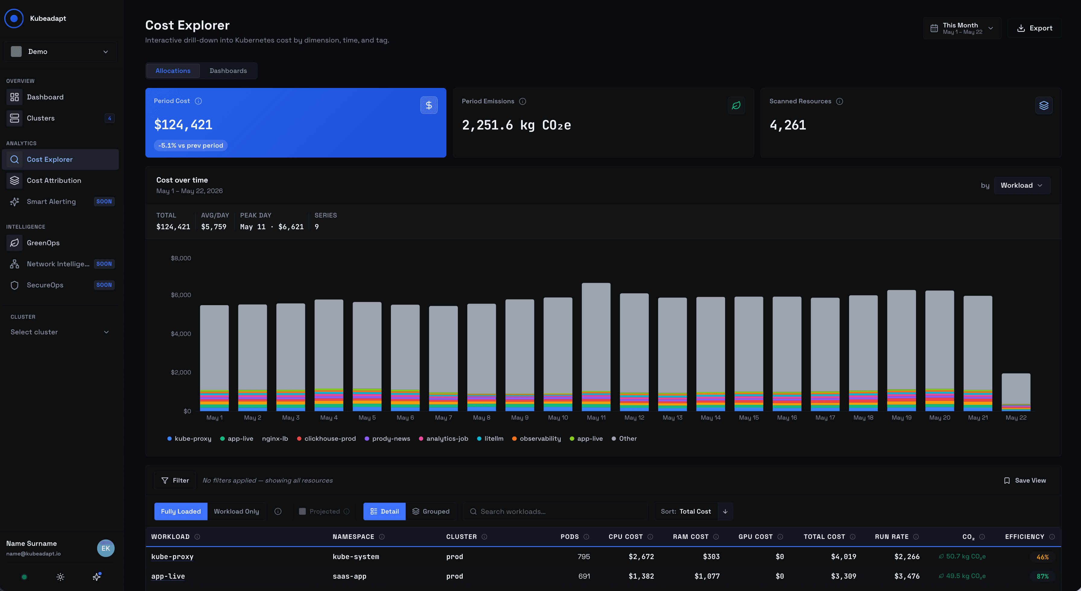 Cost Explorer Page
Two tabs, one query model
Cost Explorer ships two tabs in the top-level nav.
- Allocations is the live query. Group-by, filters, cost mode, KPIs, table, export. Every change re-runs the query against the latest cost data.
- Dashboards is your saved-query list. Every Dashboard is a snapshotted Allocations query — same group-by, same filters, same mode — given a name and (optionally) shared. See Dashboards.
Both tabs read from the same daily cost data broken down by cluster, namespace, workload, pod, node, and container. The numbers always match.
Group by nine dimensions
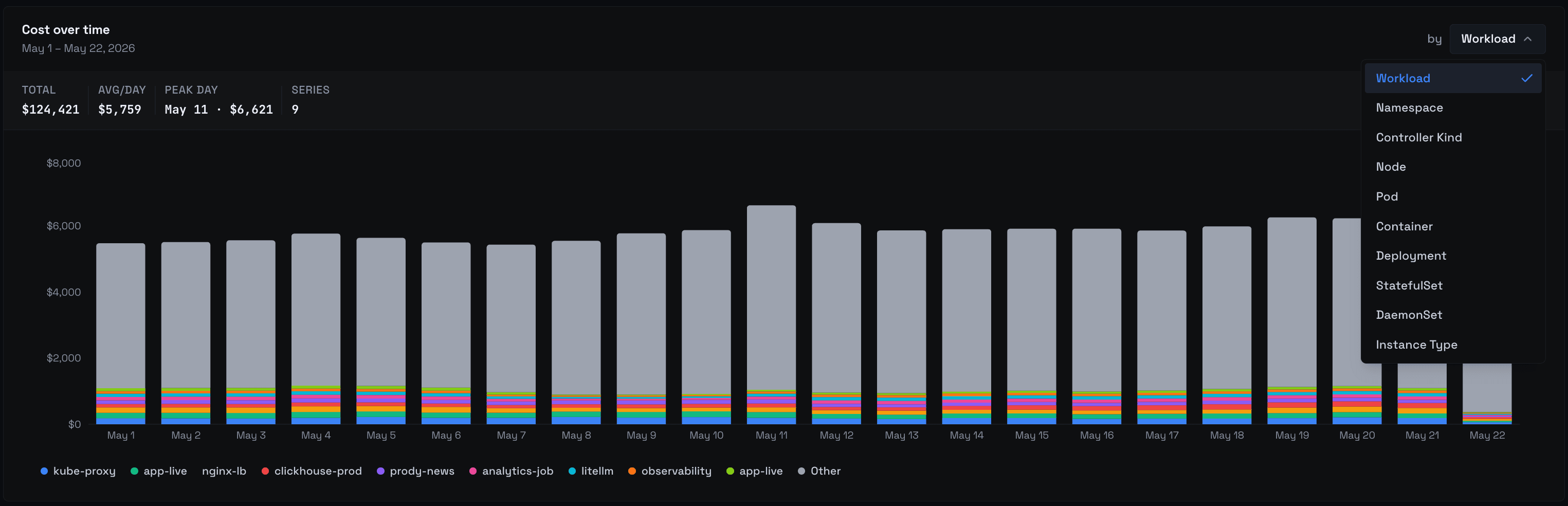 Cost Explorer Page
Pick one dimension at a time from the chips above the chart:
- Workload: the owning Deployment, StatefulSet, DaemonSet, Job, or CronJob.
- Namespace: Kubernetes namespace.
- Controller Kind: Deployment vs StatefulSet vs DaemonSet vs other.
- Node: individual Kubernetes nodes.
- Pod: individual pods (including replicas).
- Container: container name within a pod.
- Deployment, StatefulSet, DaemonSet — one workload class at a time.
Instance type (m6i.large, n2-standard-4, Standard_D4s_v5 and so on) is a filter, not a group-by.
Cluster is not a chip. Cost Explorer reads default to within-cluster, and Cluster appears as a filter axis instead — most users want to group within one cluster, not across many. To compare clusters, use the Organization Dashboard or save a per-cluster Dashboard for each.
Filter on three axes
Filters live on three axes — workload, node, and cluster — and combine with this semantic:
- Within an axis, statements are joined with OR. Filtering workload to
frontendORapireturns rows matching either. - Between axes, statements are joined with AND. Filtering workload to
frontendAND cluster toprod-eastreturns rows matching both.
The filter builder shows the operators inline as dividers so the query is readable at a glance.
Changing the group-by may prune incompatible filters. Switching from Workload to Node drops workload-only filters with a toast so you can re-apply them in the new shape.
Fully Loaded vs Workload Only
A toggle below the chart switches every visible number between the two cost modes.
- Fully Loaded (the default) — capped compute + idle redistribution + cluster overhead. This is the mode finance uses.
- Workload Only: capped compute attributable to the running pods only. Drops idle and overhead. The mode engineers use when optimizing a single workload, because idle and overhead would otherwise distort per-workload comparisons.
The math behind capping, idle redistribution, and overhead distribution lives in How costs are computed.
Granularity is daily, weekly, or monthly
Bucket size for the chart is daily, weekly, or monthly. Cost Explorer does not offer hourly granularity. For sub-day views, use the per-cluster utilization and node-monitoring pages.
Observed vs Projected
Most days are full days. A partial day — the current day, a recently-connected cluster's first day, or a day with an agent outage — doesn't have a full day's worth of measurements. By default Cost Explorer shows the Observed number: the cost for the data that actually arrived.
When the visible window's data completeness drops below 98%, Cost Explorer enables a Projected toggle. Turn it on and partial days get scaled up to a full-day estimate so the chart isn't pulled down by a half-empty bucket.
The toggle is automatically disabled when data completeness is ≥ 98% — there's nothing to project, and the Observed number is already complete.
KPI cards
Three cards sit above the table:
- Period Cost: total cost for the visible window, with a trend pill comparing to the previous equivalent period, and (when applicable) a data-coverage pill.
- Period Emissions: kg CO₂e for the same window, computed from the same per-container rows.
- Scanned Resources: count of unique resources matching the current group-by and filters.
The cards re-compute every time the group-by, filters, time window, or cost mode change. They're a quick read of whether the current query is the one you meant.
Sort and drill-down
The table sorts by Total Cost. Only the direction toggles — the field is locked. "Highest cost first" is the right read for almost every cost investigation, so Cost Explorer keeps the page predictable by not offering sorts that would lead to misleading takes.
Click a row's name to open the entity page — a workload detail page, a namespace view, a node detail page, depending on the current group-by. When grouped mode is available, click the chevron at the start of the row to expand it into per-cluster children.
Grouped mode is disabled for the node and pod axes. Those entities already belong to one cluster, so a per-cluster expansion would add nothing.
Exports
Two formats:
- CSV: up to 10,000 rows. Larger queries return the first 10,000 with a toast prompting you to refine filters. The CSV reflects the current group-by, filters, cost mode, and time window.
- PDF: up to 500 rows. Larger queries return the first 500. The PDF is the formal share-with-finance artifact and includes the chart, the KPI cards, and the top rows.
Both exports use the same number basis as the on-screen view — change Fully Loaded to Workload Only and the export changes too.
When you save a query
Save the current Allocations query as a Dashboard from the Save button next to the time picker. Dashboards remember group-by, filters, cost mode, projection toggle, and the relative time-range preset (Last 7 days, Last 30 days, Month to date, etc.). They don't remember absolute date ranges — re-opening a Dashboard always re-evaluates against "now".
See Dashboards for the share-with-org flow.
What's not here
A short list of things readers often look for and won't find:
- No anomaly markers in the chart. Anomaly summaries appear in the exported PDF; live anomaly detection lives in Smart Alerting, not Cost Explorer.
- No forecasting overlay. Projected scales partial-collection days only.
- No scheduled email reports. Use Reports for the cadence-driven archive.
- No public share link. Dashboards share within your organization; there is no anonymous or off-platform share URL.
- Sort field is locked to Total Cost. Direction toggles; field does not.
- No hourly granularity. Daily is the smallest bucket.
- Cluster is not a group-by chip. It's a filter axis.
Next steps
- How costs are computed: the math behind Fully Loaded, capping, idle redistribution, and overhead.
- Dashboards: save the current query and share it with the org.